 eCommerce
 Sistemas de assinatura
 Chatbot
 Cursos Online
 Agendamento online
 Guia de viagem
 Eventos
 Criadores de Conteúdo
 Entrega local e coleta na loja
 Jornais
 Rádio
Rádio Escolas e Universidades
 Espiritualidade
 Organizações
 Restaurante
 Mercearia
 Crie seu app sob medida
 Comunicação dos Funcionários
 APP BUILDER SEM CÓDIGO
 TECNOLOGIA
 POR QUE GOODBARBER?
 Design
 RECURSOS DO PRODUTO
 TÓPICOS
 REVENDEDOR DE APPS
 DESCOBRIR



UI Elements
UI elements are the building blocks of our components. Each element combines atoms of the design system to do a single job. Assembled together, elements form the components of the app.
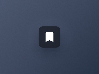
Action
The contextual button to act on a piece of content.
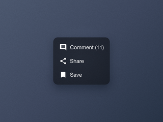
Actions Menu
One icon that opens every action available on a piece of content.
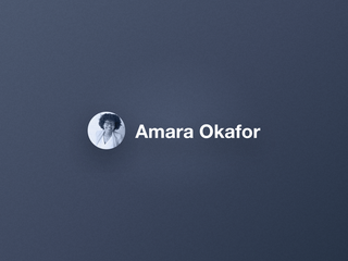
Author
The avatar and the name that credit the creator of a piece of content.

Content
The stack of text blocks that describes a piece of content in a cell.
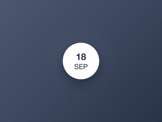
DateBullet
The date of an event, at a glance.
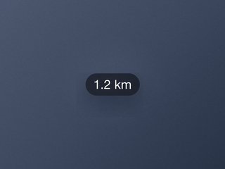
Distance
The label that shows how far a place is.
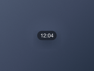
Duration
The label that shows how long a video lasts.
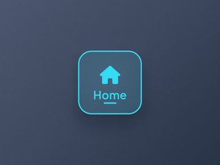
Item
The structural unit of a navigation entry, with its child elements.
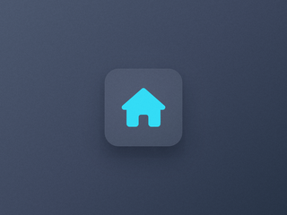
Item Icon
The pictogram of a navigation entry, on its own background layer.
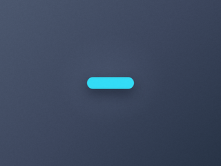
Item Indicator
The marker of the selected entry of a navigation.
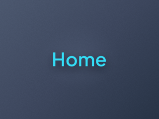
Item Label
The text of a navigation entry, in three sizes that adapt to each device.
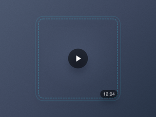
Media
The container that anchors elements over a cell's image.
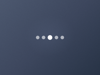
Pager
The dots that show where you are in a carousel.

Play
The icon that signals playable media.
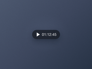
Player
The control that plays and pauses audio, right from its cell.
Text
A basic element, a piece of text styled by its context.
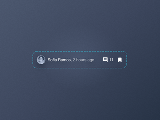
ToolBar
The row that lines up the metadata and the actions of a cell.

Widget Header
The title bar of a home widget, and its link to the section.


