Introduction
We use 2 types of measure units for spacing inside and between components: Pixels, and the gutters size (G).
Pixels and gutters are used to create consistent and visually pleasing spacing between and inside components.
Pixels (px) are a fixed, absolute unit that stays the same regardless of screen size or resolution. Using pixels as a unit of measurement can be useful for setting precise and consistent spacing between elements, especially when working with smaller, detailed elements.
Gutters (G) are a unit of measurement that refers to the space between columns in a the grid. A gutter size is typically defined in pixels and it is used to create consistent spacing between columns, it helps to create a structured layout and improve readability. It is a relative unit that can be scaled depending on the screen size and device.
By using a combination of both units, we create a visually pleasing and easy-to-use layout that is consistent across different screen sizes and devices. Pixels can be used for precise spacing of smaller elements, while gutters can be used to create consistent spacing between larger elements like columns. This allows for a balance between precision and flexibility when working with spacing, and it can help to ensure that the design is visually pleasing and easy to use on different devices.
Spacing based on gutter value
G is used to space components within a group and between groups. As this value depends on the device used, it allows the layout to be responsive and to adapt to the screen size.
As a reminder, the gutter value is: 8px for mobile, 20px for tablet, 28px for laptop and 32px for desktop.
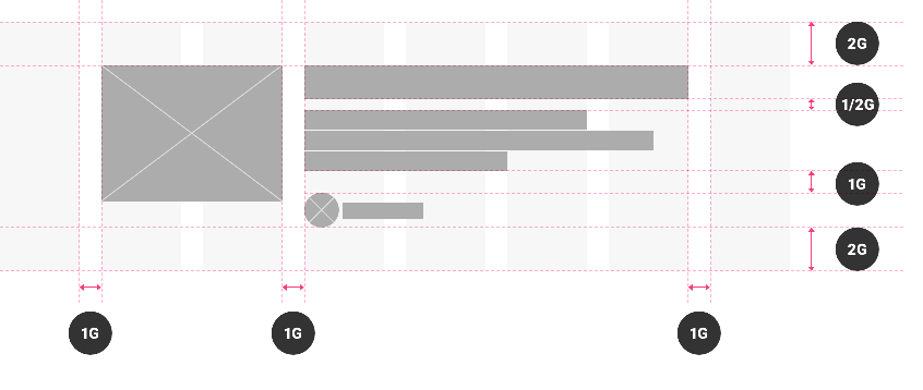
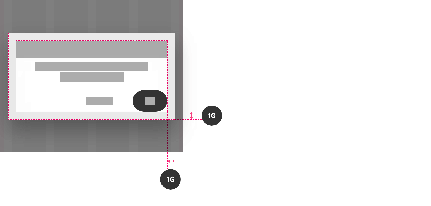
The gutter value is also used for padding:
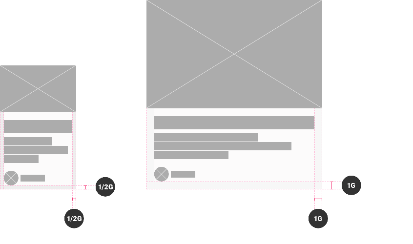
Spacing based on pixels
Pixels are used for small components as below, when space is limited:


We also use pixels for some components that will have the same organization on all platforms.
For example:


The vertical spacing option
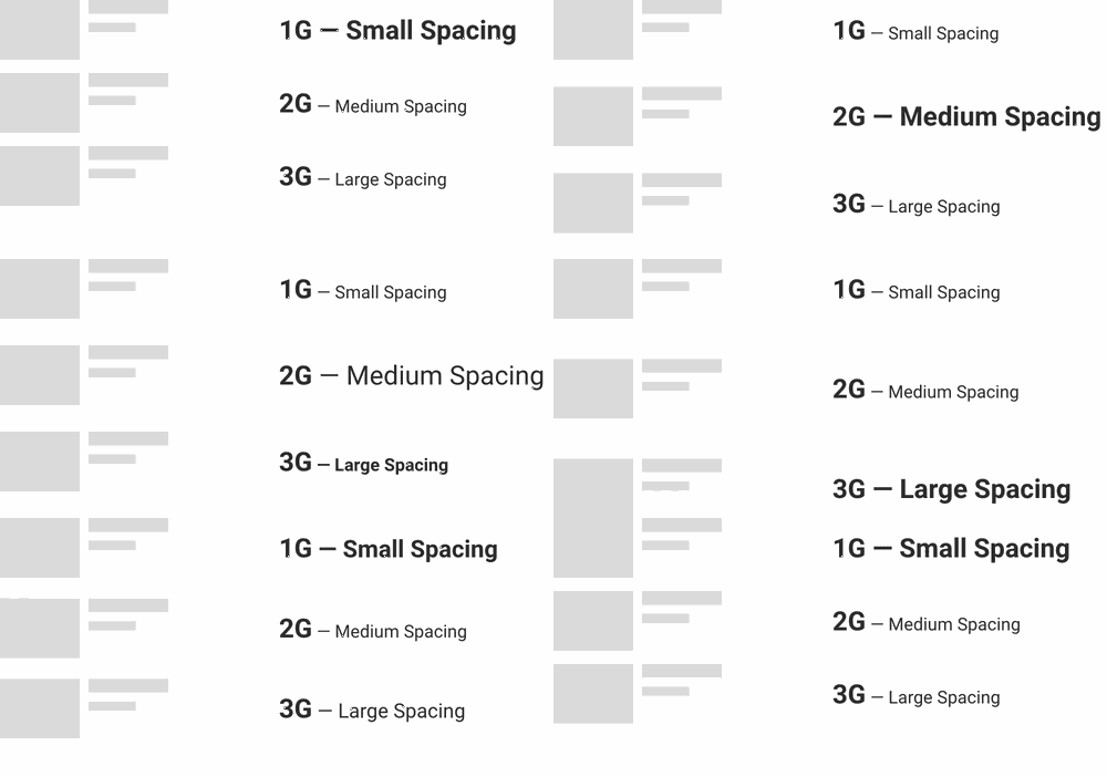
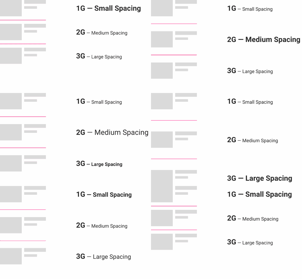
Users can choose between 3 options for the spacing of the blocks, depending on how they want the page to look, more airy or more compact :
1G — Small Spacing
2G — Medium Spacing
3G — Large Spacing
This concerns list items and widgets
The divider option
If the divider option is activated, the space between the elements is applied twice. Like the vertical spacing option, this concerns list items and widgets.
 Design