Introduction
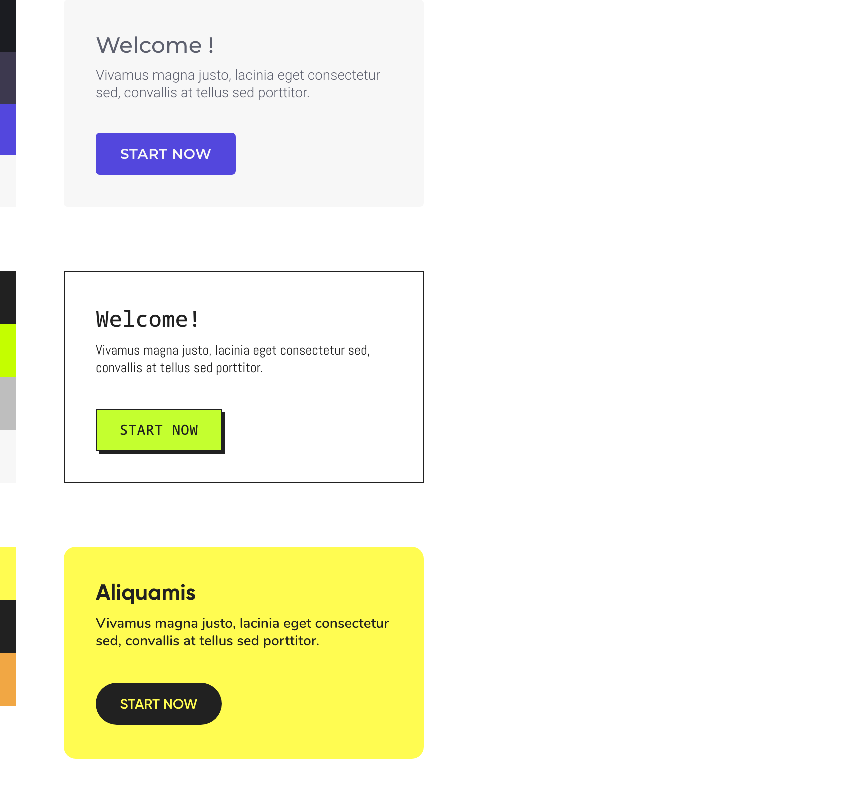
In our design system, users can apply color to various components of an app in different ways. Our approach is to provide a set of predefined color themes for users to choose from. These themes include a range of colors that have been carefully chosen to work well together and create a cohesive and visually pleasing design. Users can then select a theme that best matches their preferences or the branding of their app.
Users can also have the option to fully customize their app's color scheme by choosing individual colors for different components. This can include colors for the background, text, buttons, and other elements of the interface. This allows users to create a more unique and personalized design, and can be especially useful for apps that need to match a specific brand or color scheme.
Basic color set
4-color set
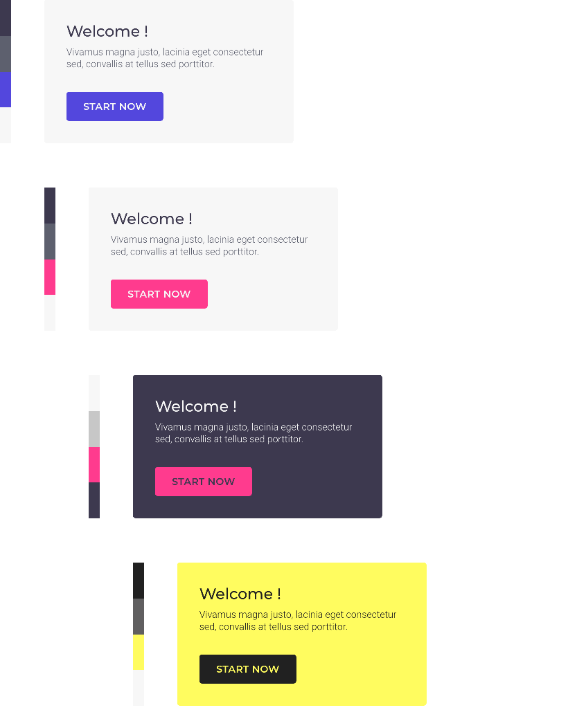
A set of 4 colors is associated with each theme. Each color in the set is associated with items of the app:
Users can change the color set of their theme , the new colors are automatically assigned to the items.

Customize colors individually
In order to customize the app, users can modify each color of a set individually. The new color is automatically assigned to the items.

Advanced customisation of elements
Advanced users have access to the complete list of items and their associated color. They can change the color of each item one by one.
 Design