Introduction
The Checkboxes & Radio Button allows users to make selections and make choices within your app. The GoodBarber design system offers a consistent and intuitive experience for this component across all platforms. With a variety of styles and options, the Checkboxes & Radio Button component is a versatile tool that can be used in a variety of contexts, from simple forms to more complex interfaces.
Whether you're building a survey, a quiz, or a data entry form, the Checkboxes & Radio Button component is an essential part of your toolkit. With clear, easy-to-use design, it ensures that users can make their selections with confidence, and without confusion.
Anatomy
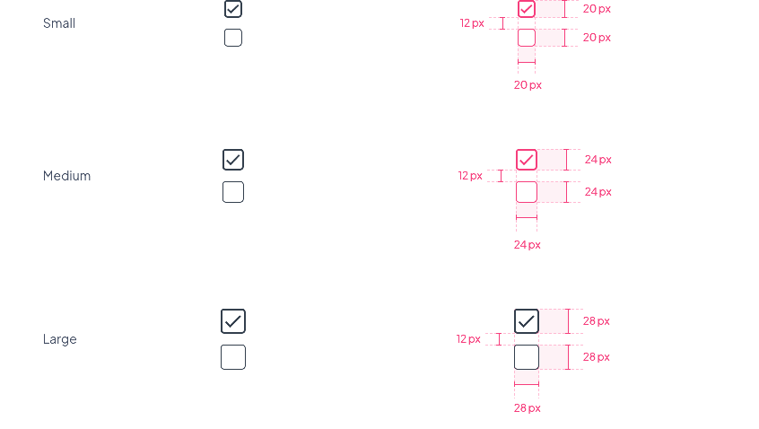
Checkboxes
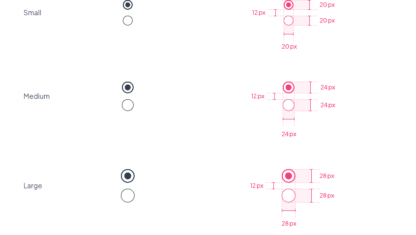
Radio buttons
Font Size
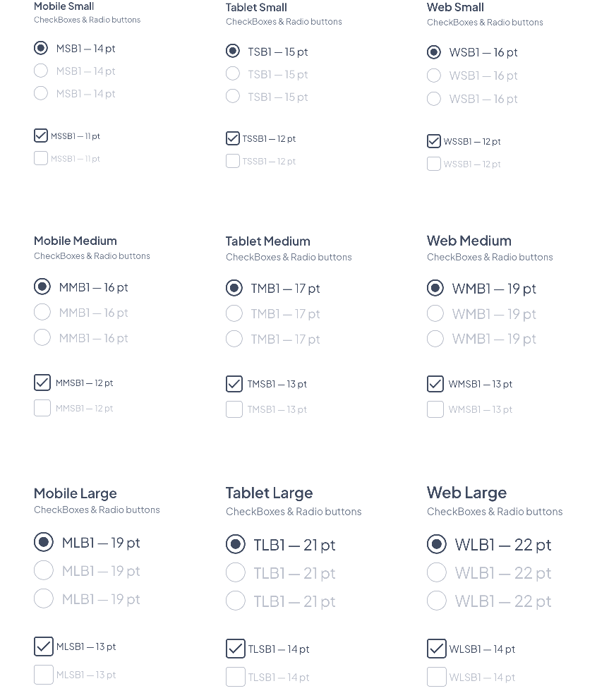
The Font size changes depending on the devices and the choice of the component size.
| Component Size | Text Level | Mobile | Tablet | Web | ||||||
|---|---|---|---|---|---|---|---|---|---|---|
| Small | Body 1 | 14 | 15 | 16 | ||||||
| Small Body 1 | 11 | 12 | 12 | |||||||
| Medium | Body 1 | 16 | 17 | 19 | ||||||
| Small Body 1 | 12 | 13 | 13 | |||||||
| Large | Body 1 | 19 | 21 | 22 | ||||||
| Small Body 1 | 13 | 14 | 14 |
Properties
Shape
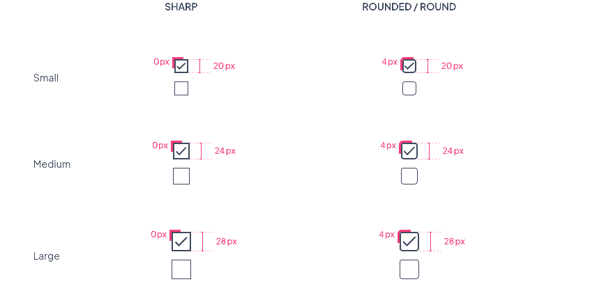
Checkboxes Border Radius
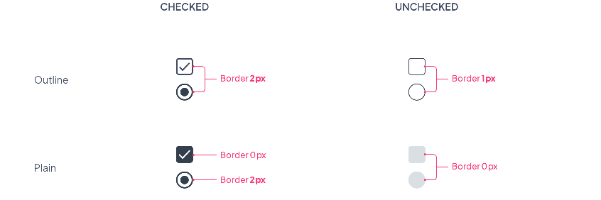
Plain & Outline options
Border size values by state for all sizes (Small / Medium / Large)
Layout
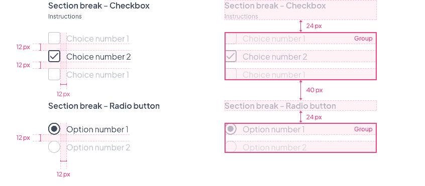
Spacing within a form
Spacings will be the same for all text or component sizes. To see how the components behave within a form, please refer to the Form Layout section
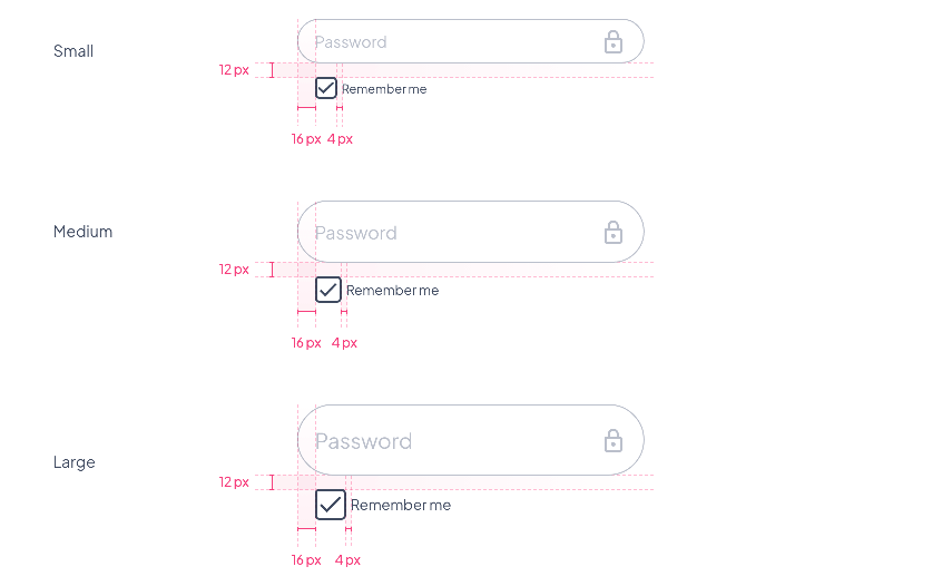
Spacing with a textField
Spacings will be the same for all text or component sizes
Preview
Below a preview where we can find:
- The 3 component sizes Small / Medium / Large
- The corresponding font sizes
- The 2 options Plain and Outline
- The 3 shape options Sharp / Rounded / Round
 Design