Introduction
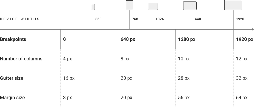
Breakpoints are a key aspect of responsive design, which is the practice of designing and building websites and applications that look and function well on a wide range of devices and screen sizes. Breakpoints are used to create different layouts for different screen sizes.
Breakpoints are used to determine when the layout of a page should adjust in order to provide the best user experience on different devices. For example, a page might have a different layout when viewed on a desktop computer versus a mobile phone, and breakpoints are used to define at which screen width the layout should change.
When a page is viewed on a device with a screen width that is larger than the largest defined breakpoint, it will use the layout defined for the largest breakpoint. Similarly, when a page is viewed on a device with a screen width that is smaller than the smallest defined breakpoint, it will use the layout defined for the smallest breakpoint. For screen sizes in between the breakpoints, the layout will be determined by the nearest breakpoint.
With the growing number of devices with different screen sizes, responsive design has become a crucial aspect of modern app/web development and breakpoints play a key role in it.
Responsive Breakpoints
Summary table

 Design